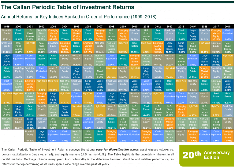
No one is more surprised than I am at the longevity and usefulness of the Callan Periodic Table of Investment Returns. I put the table together in 1999 as a lark, in an effort to convince our clients’ investment committees that U.S. large cap growth stocks were not always going to be the best-performing asset class. Recall that 1999 was close to the peak of the Dot-Com Bubble, and the tail end of a long run of very strong growth outperformance. At the time, clients constantly asked: Is value dead? Why bother with non-U.S. equity?
The goal of the table was to show how asset classes and particular equity styles (growth and value, large and small cap, U.S. and non-U.S.) go in and out of favor, and how stocks and bonds interact over market cycles. The table was also designed to convey the strong case for diversification, and its original title was the rather mundane “The Benefits of Diversification.” After putting the chart together, however, it looked to me just like the Periodic Table of the Elements that I used to stare at in high school chemistry class—and so the Callan Periodic Table of Investment Returns was born.

The table can also provide other useful insights for investors, such as the importance of understanding the difference between absolute and relative performance.
For instance, the ranking for fixed income (as described by the Bloomberg Barclays US Aggregate Bond Index) during 2006-09 shifted from worst in 2006 to best in 2008 back to worst in 2009 (excluding cash), even though the returns only ranged from 4.33% to 6.97%. The best-performing asset class in 2006, nearly 2007, and 2009 was emerging markets, clocking 32%, 39%, and 78% (!), but emerging was also the worst-performing asset class in 2008, losing 53%, the year bonds ranked first. In this instance, the table provides a clear demonstration of just what it means to take on equity risk versus fixed income risk.
Over time, the table has expanded to include other liquid market strategies—high yield, emerging market equity—and spawned tables that include more asset classes (real estate, hedge funds, private equity, commodities) and broader definitions of asset classes to more broadly compare market betas, rather than equity styles. Our full collection is available on our website here.
The Periodic Table, in all its variations, has become one of the most popular pieces of research that Callan produces every year. It has also been widely copied throughout the industry—and as the saying goes, “Imitation is the sincerest form of flattery!”
The enduring appeal of the table in my mind is its ability to be understood at a glance—it conveys a lot of information—and once you’ve seen it and absorbed it, you can refer to it again and again. New insights still come to me, the author, even 20 years later!

